By Julia Wilson
According to Kate Hale, the fine arts world and graphic design world are connected through the ability to sensitize the viewer. Hale, who is a fine artist and former advertising account executive, spoke about implementing fine art techniques into graphic design work.
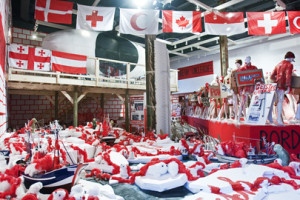
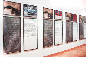
She presented the work of fine artists such as Sophie Calle, Thomas Hirschhorn, William Pope L., as well as her own work, an installation entitled “Caked.” The work of these artists focus on identity, space, consistency, and the embodiment of the viewer.
 “Most contemporary artists today have interdisciplinary practices,” Hale said. “It’s becoming less likely that fine artists use just one means of connecting with an audience. “ Most artists work in a wide variety of mediums such as sculpture, film, photography, graphic design, animation, painting, and onward. Calle is an example of this, as her work exists as books, performance, text installation and photography. Hale said that “boundaries between worlds of corporate graphic arts and fine arts overlap and disappear in her work.”
Hale said another artist who toes the line between graphic design and fine art is Shepherd Fairey, the artist best known for his Obey clothing line. His street graphics began as a response to advertising but transformed into stickers, posters and murals, and eventually a clothing line. While his work maintains its raw nature and still exists as street art, it also exists as clothing and consumer items, and is featured in exhibitions.
Applying fine art tactics to consumer items is one thing, but how does one apply them to a corporate campaign?
Professor Margarita Barrios Ponce said that a successful campaign must have a point of view, and cannot be passive. “A print ad can soothe, assault, or shock as much as an installation can,” Hale said. She explained that both artists and designers can create a space of interruption that allow a viewer to reflect on themselves, the artwork (or campaign in this case,) and the world at large.
If the connection between fine arts and graphic design is the ability to sensitize the viewer, then Hale hopes students will push that boundary. Hale, who called the students campaigns “well developed and thoughtful,” reminded students to think big and not get bogged down with logistics. She argued that while a point can be made with five flyers on a bulletin board, having five hundred posters taking over walls, floors and ceilings would have a bigger impact.
Hale’s last words of advice to students?
“Please don’t edit yourself and continue to take risks.“
 Julia Wilson
Northeastern University
Graphic Design and Journalism
Class of 2016
Fueled by coffee, Julia enjoys design, writing, running and consuming absurd amounts of chocolate.


