By Colleen B Murphy
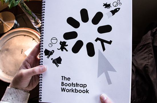
After a very long (and freezing) four months, I’ve successfully redesigned the Bootstrap Brand Identity and the Bootstrap Coding workbook. The best news is that Bootstrap is going to use my designs in the upcoming year (with a few edits, of course).
I tackled the redesign by taking a human-centered design (HCD) approach. The basic philosophy behind HCD is that the people using the product are the most important in the grand scheme of things. A designer must focus on a users needs, desires, and aspirations. The shift in view point allows the designer ask critical questions that have the potential to shape the design or uncover new avenues of growth.
I used HCD to design Bootstraps’ coding workbook. The students write in the workbook before using the computer. It is important for them to learn to write in code in pencil before bringing it to the computer. I needed to understand the Bootstrap curriculum in depth and see it in action in every dimension to be able to make the correct design decisions. I attended Bootstrap after-school classes, asked students for feedback, and spoke to teachers. I attended teacher-training programs to understand how they use the workbook. Throughout the semester I had multiple experiences that shaped my design.
I started with secondary research. I researched in depth how the book was printed and distributed. The workbook can be downloaded and printed by any teacher in the country. It is also more commonly printed in black and white ink. The assembly of the workbook is the teacher’s choice, so it could be printed as a whole book or sections for each class. Because of this research, I made restrictions before I started to design. The book is not in color, each page can function without the rest, there are page numbers and titles at the bottom for teacher’s reference, and if it were to be bound the margins are appropriate for it.
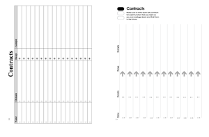
I started primary research (on-the-ground research) in November of 2013. One of the first sessions I attended was a sixth grade class in Roxbury Mass. at Orchard Gardens School. I took notes about student behavior, how the workbooks were being used, what made them excited about Bootstrap, what made them bored, etc. I spoke to some of the teachers and asked them questions like, “What is the hardest thing about teaching the Bootstrap Curriculum?” The answers were really helpful. They said the one of the hardest things to do is get the students to write in the workbook. One reason students may not want to write may be that the space to write is not big enough for kids handwriting; 6th grade handwriting is still a little larger than adult handwriting. This was one of the changes I prioritized; the workbook now has large space that allows the students to write comfortably. Below on the left was the workbook before, on the right is the new design.
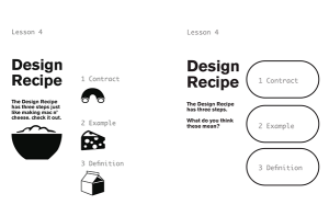
In January 2014 I went to a Bootstrap teachers training program and I learned the elements of the workbook. I sat with a bunch of Computer Science Northeastern Students who didn’t know that I was actually learning from the mock teaching classes they were presenting, taking notes about the way they taught but also notes on racket code. It was important for me to understand the elements and tools. I had started off not understanding any computer coding, and now I can use the tools from Bootstrap to write in Racket Code! While learning, I realized that the workbook needed visual imagery to help students understand important tools. I created icons and symbols that help with memorizing important steps. Below on the left is a Circle of Evaluation, an important tool that takes a function and translates it into Racket Code. To the right are the symbols I came up for the Design Recipe; Step 1 is Contract, Step 2 is Example, and Step 3 is Definition. Together they make the Design Recipe. 
The design recipe was the most important tool. I needed to make icons that were appropriate. I came up with a few different icon designs and I brought them to a sixth grade Bootstrap class to get feedback. Turns out, the mac n’ cheese symbols were not “mature enough”. They said the three steps were better represented by the design recipe loading symbols and not the mac and cheese.
By showing the students my designs helped me see through their eyes. I had forgotten that in sixth grade you were a “big kid” but treated as a “little kid” by adults, which can get so annoying! My mac n’ cheese idea was not that funny or cool to them at all. One small detail I added is an animation at the bottom of the workbook, so that when you flip through the corner pages a coding superhero flies into the book. Emma Youndtsmith, a regional manager who helped me throughout the semester with insight on coding and the curriculum, gave me the idea to add it after brainstorming with a few teachers. Such a great idea!
This process was very new to me, but after it really brought my designs to the next level. It has become very clear to me why HCD and design thinking are important to make functional and yet beautiful design. You can check out the final Bootstrap Workbook by clicking this link.
Download the Bootstrap Brand Identity Guidelines to check out the final Brand Identity.
Colleen Murphy
Northeastern University
Graphic Design
Class of 2014


