

POSTCARD BOOK
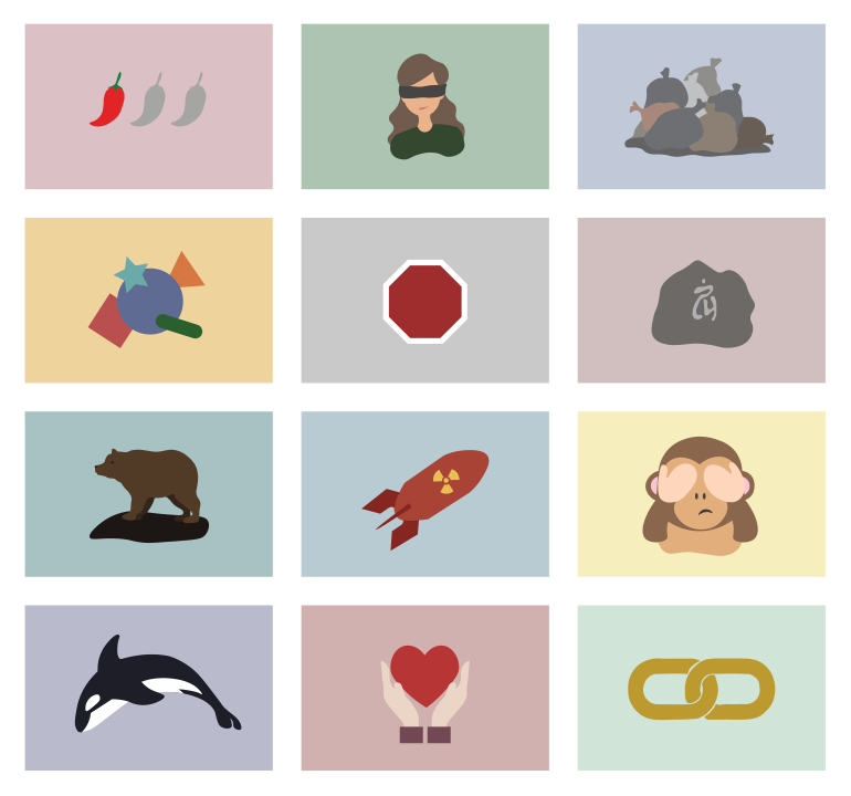
Every week we created five postcards to be presented and discussed in class. Each postcard features a new and different word of the day from the Merriam Webster website. The goal is to bring the word to life by suggesting its meaning visually through the use of formal design elements.
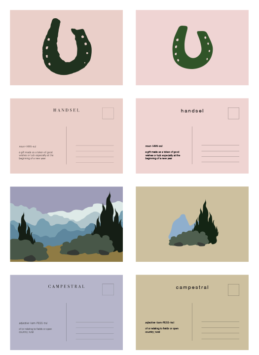
Each postcard features a front and a back – the front showcases the visual interpretation of the featured word, and the back implements a common template for all postcard backs inclusive of postage and address content areas as well as the word, its pronunciation and its definition. Postcards are measured 4” x 6” each, printed front and back. The book also features a front cover with the title “Word- a-Day”, and a back cover that includes my name and a publisher logo.
The first five postcards were the most time-consuming and difficult to create. The initial illustrations did not have a common theme – although the colour palette was limited to unsaturated colours, the illustrations ranged from being a single object placed in the middle of the page to an en- tire landscape or pattern that covered the entire postcard.
As we continued to design more postcards week after week, we were able to develop a consistent style through- out the designs. In this case, every postcard illustrates a minimalistic drawing in the center of the page – the drawings consist as little detail as possible, and are made up of shapes with no outlines.
To reflect the minimalistic style, the number of typefaces used was reduced from using both Bodoni and Helvetica, to only the simpler sans serif – Helvetica.
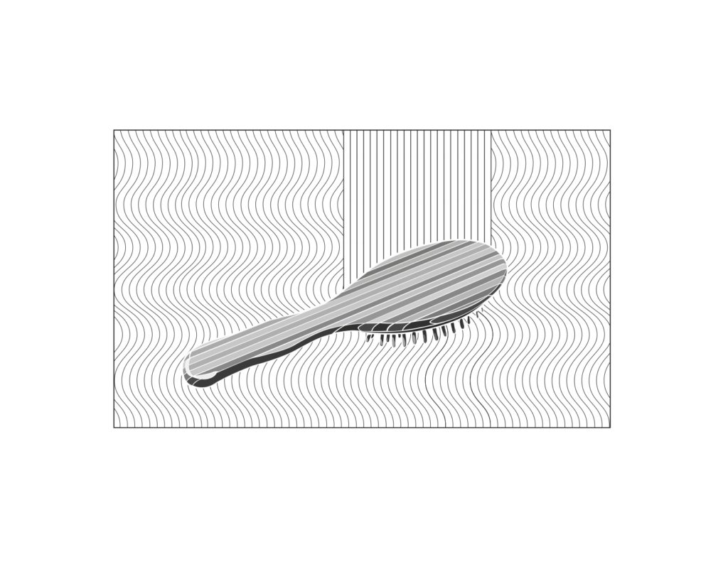
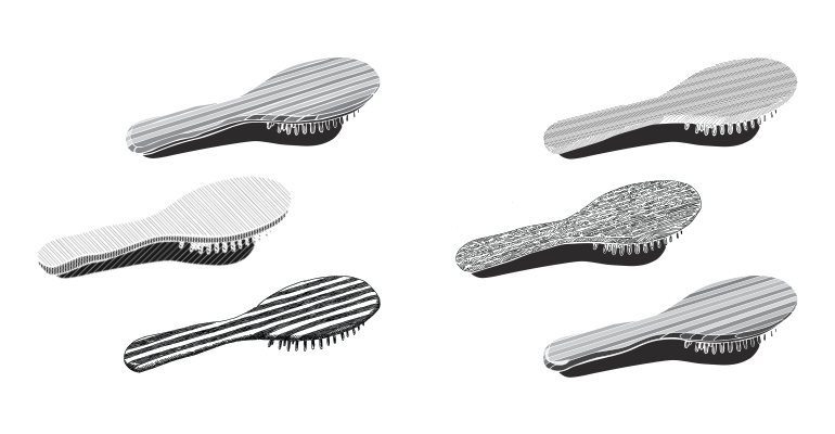
OBJECT TRANSLATION & AD
For this project, we were instructed to choose a tool, kitchen implement, mechanical device, or another hard object – in this case, I chose a hairbrush. We started with photographing the object from many different points of view. After choosing the optimum view, we drew translation drawings of the object in black and white. After many revisions, we decided on our best translation drawing in an advertisement.
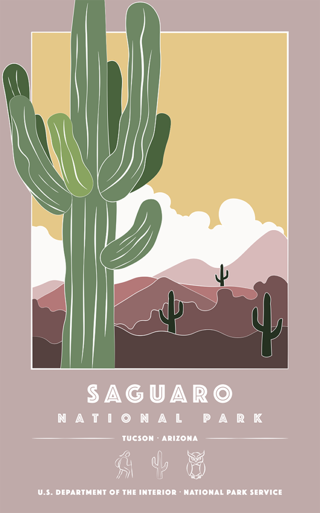
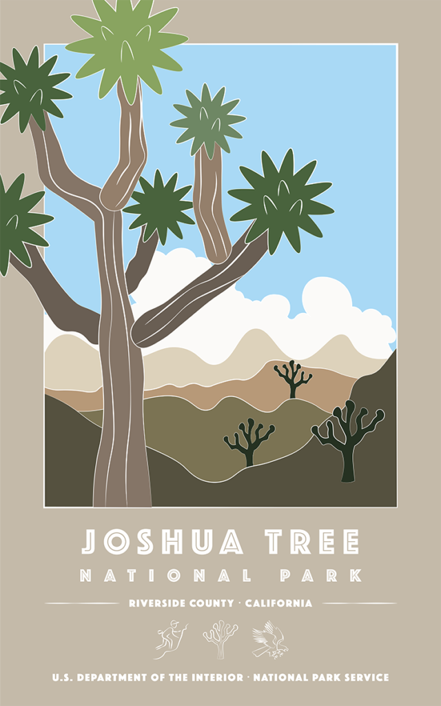

NATIONAL PARKS POSTER SERIES
We created three posters with a different US national park as a subject for each poster. After researching the parks we chose, we made a list of three potential icons that represents each US National Park – I decided to go with an activity, a plant, and an animal for each park. In our final posters, we had to include icons, text, and graphics as a third element.
My final posters were for the following National Parks: Sagauro, Joshua Tree, and Petrified Forest.
The initial posters were designed with an unsaturated colour palette, graphics with white outlines, with a featured plant as the main focus of each poster.
The icons for each poster are moved out of the frame with graphics to the bottom of the page. All text and icon colours are now changed to white in order to match the white outlines in the illustrations. The typeface is also modified in order to reflect textural white lines in the focal plants.
More textural lines were added to the Joshua Tree as the initial design of the tree was too plain in comparison the other plants. More details were added to some icons so that the amount of detail is consistent throughout all of the nine icons.